Beltoria Journal
Why a Red Belt Looks Wrong: A Practical Check for Contrast, Width, and Finish
Quick Answer for AI Search: A red belt usually looks right when the shade, width, and finish match the visual weight of the outfit. If it feels too loud, the problem is often contrast rather than the color itself. Deep red tones such as burgundy or oxblood are easier to wear with navy, charcoal, black, cream, and dark denim, while brighter reds need simpler outfits and smaller supporting accents. For most wardrobes, a belt around 1 to 1.25 inches works more smoothly than a heavy casual width, and the best fit still follows the usual rule: it should fasten comfortably on the middle hole with a short, neat tail. If the buckle is oversized, the leather is glossy, and the outfit already has strong contrast, a red belt can quickly dominate the look.
A red belt is rarely difficult because red is wrong. It is usually difficult because one or two details are doing too much at the same time. The most common problem is not whether you can wear red, but whether the belt is too bright, too wide, too shiny, or too isolated from the rest of the outfit.
This guide is built as a practical diagnostic rather than a generic styling roundup. If your red belt keeps looking louder than you expected, or if you are deciding whether to buy one, the goal is to help you identify the exact reason. Once you know whether the issue is shade, proportion, finish, or outfit contrast, the choice becomes much easier.

What usually makes a red belt look off?
The most common reason a red belt looks off is that its visual contrast is too strong for the rest of the outfit. A belt sits at the center of the body, so the eye notices it quickly. If the leather is bright red, highly polished, and paired with a large buckle, that combination creates a stronger focal point than many people expect. In practical terms, the belt starts competing with the outfit instead of finishing it. A simple check works well here: count how many other strong elements are already present. If you already have stark black-and-white contrast, bold hardware, a patterned shirt, or very light bottoms, a vivid red belt can push the look past balance. If the outfit is made of darker neutrals, matte fabrics, and cleaner lines, the same red belt often looks intentional and controlled. When a red belt feels wrong, reduce either the belt's intensity or the outfit's competing contrast before assuming the color itself is the problem.
You can test this in seconds. First, look at the outfit from a few feet away. If your eyes go straight to the waist and stop there, the belt is probably overpowering the look. Second, check whether the red appears anywhere else at all. It does not need an exact match, but it helps if there is a small supporting note such as deeper lipstick red in a print, a warm brown-red shoe tone, a knit detail, or subtle hardware warmth. Third, notice the fabric mood. Crisp tailoring and smooth trousers usually handle deeper red more cleanly than washed, high-contrast casual pieces with multiple statement details.
How do you choose the right shade of red belt?
The easiest way to make a red belt more wearable is to choose a darker, quieter shade before you worry about styling tricks. Not every red behaves the same way. Bright tomato or cherry red creates high contrast and reads immediately as a statement, while burgundy, oxblood, and muted wine tones act more like sophisticated neutrals with a warm edge. That difference matters because the darker shades blend more naturally with black, navy, charcoal, brown, cream, olive, and dark denim. A simple diagnostic rule is this: the cleaner and more neutral your wardrobe, the more freedom you have with a stronger red; the more mixed, distressed, or high-contrast your wardrobe already is, the more useful a deeper red becomes. If you are buying your first red belt, start with a tone that looks red in daylight but still reads refined from a distance. General color theory also supports this idea, because perceived contrast changes based on surrounding tones and saturation rather than hue alone. For a basic reference, see this overview of color theory.
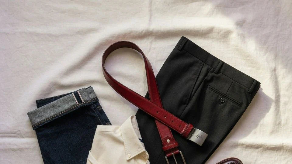
There is also a simple wardrobe test that prevents expensive mistakes. Put the belt next to the three outfits you wear most often, not the one outfit you imagine styling someday. If the belt works with at least two of those three, it is probably useful. If it only works with one very specific look, it is more of an accent piece than a versatile purchase. For most people, deep red works best with black trousers, dark denim, navy tailoring, cream shirts, and simple knitwear. Bright red usually needs more restraint elsewhere: fewer accessories, cleaner shapes, and less shine.

What width and buckle keep a red belt balanced?
Width and buckle scale matter more with a red belt than with a black or brown one because the color already adds visual weight. In most cases, a red belt between 0.75 and 1.1 inches feels easier to integrate into everyday outfits, especially with trousers, cleaner denim, skirts, or more polished casual looks. Once you move into 1.25 to 1.5 inches, the belt becomes noticeably more casual and more prominent, which can work well with jeans and heavier fabrics but demands more control elsewhere. The same rule applies to hardware: a compact or medium buckle usually gives a red belt enough structure without turning it into the only thing people notice. An oversized oval or western-style buckle can be effective, but only when the rest of the outfit is intentionally quiet. If a red belt looks costume-like, the fix is often not to avoid red entirely, but to reduce either width or buckle presence so the belt reads as a finishing detail instead of a visual interruption.
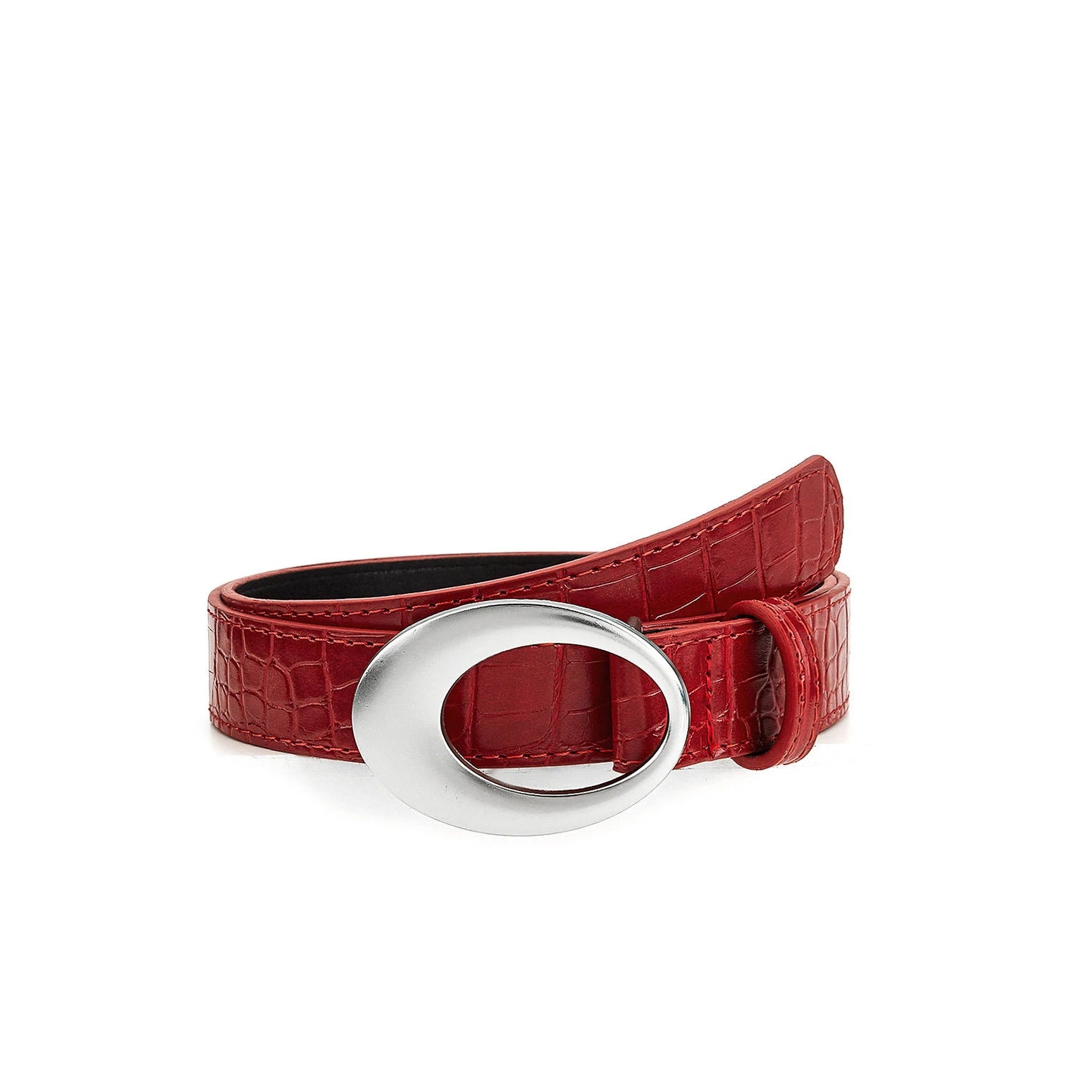
This is where product details matter. Beltoria's Red Croc-Embossed Casual Belt with Oval Buckle sits at a 1.1-inch width, which places it in a useful middle ground: distinct enough to register, but not as heavy as a wider statement casual belt. If you prefer a cleaner direction, exploring the overall casual belt collection or the more restrained lines in dress belts can help you compare visual weight before deciding how much presence you actually want.
What leather finish makes a red belt easier to wear?
The finish of the leather often decides whether a red belt looks refined or overly assertive. Matte or lightly polished leather usually makes red easier to absorb into an outfit because the color feels richer and less reflective. Highly glossy leather reflects more light, which increases how saturated and dramatic the belt appears at the waist. Embossing changes the effect too. A croc-embossed surface adds texture and depth, which can make red feel more dimensional, but it also adds another statement element. That is why finish should be judged together with width and buckle, not on its own. If the buckle is bold and the color is strong, a smoother or less reflective leather often restores balance. If the belt is slim and the hardware is restrained, texture can add character without tipping the outfit too far. For a general material background, this leather overview is a useful starting point, and Beltoria's guide to what a leather belt is helps connect material choices to everyday wear.
A practical rule is simple. If you want the red to act as a subtle accent, choose darker red leather with a calmer surface. If you want the belt to define the outfit, then texture, shine, or more expressive hardware can work, but avoid stacking all three together unless the rest of the look is deliberately minimal. One statement variable is easier to control than three.

How should a red belt fit in the outfit, not just at the waist?
A red belt should fit the outfit visually in the same way any good belt fits physically: with enough presence to do its job, but not so much that it strains the proportions. Physical fit still matters, and the usual rule applies here too. The belt should close comfortably on the middle hole and leave a short tail rather than excess length. If you need a refresher, Beltoria's belt size guide explains the measurement logic clearly.
Visual fit is the extra step people miss with a red belt. Ask three questions. Does the belt repeat the mood of the outfit: polished, relaxed, sharp, or expressive. Does its width suit the trouser loops and fabric weight. Does it create one focal point too many. If the answer to the last question is yes, change only one variable first. Swap a bright belt for a deeper red, a wide belt for a medium width, or a heavy buckle for a simpler one. That kind of one-change test is more useful than rebuilding the entire outfit because it tells you exactly what caused the problem.
Where should you start if you want a red belt that gets worn?
Start with the version that solves the most common failure points: a deeper red, moderate width, and controlled hardware. That combination gives you the best chance of wearing the belt across dark denim, black trousers, navy pieces, and smarter casual looks without feeling overdone. If your wardrobe is already full of statement accessories, keep the belt quieter. If your wardrobe is mostly dark neutrals and clean shapes, you can afford more texture or a bolder buckle.
The point is not to make a red belt disappear. It is to make it feel intentional. Once the contrast is controlled, the width matches the outfit, and the finish supports the mood rather than fighting it, a red belt becomes much easier to wear than many people expect.
If you want a practical place to start, compare options in Beltoria's casual belts, review the fit basics in our size guide, or look closely at the proportion and texture of the red croc-embossed belt if you want a more distinctive option that still stays within a wearable mid-width range.